Project Duration
August 2022-October 2022
My Role
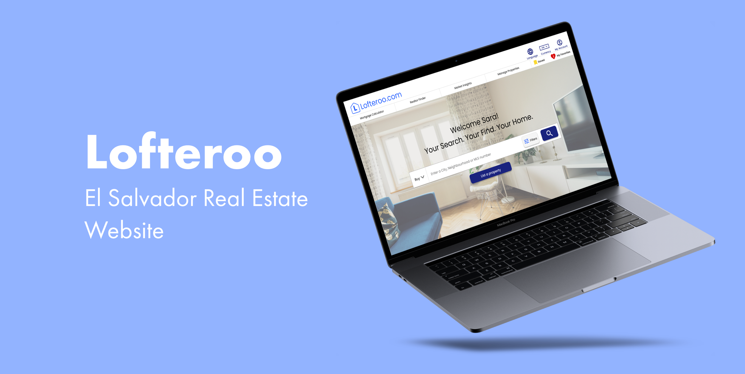
Google UX Design Student designing a website for a Real Estate website based in El Salvador from conception to delivery.
Conducting interviews
Paper and digital wireframing
Low and high-fidelity prototyping
Conducting usability studies
Accounting for accessibility
Iterating on designs
My Responsibilities
Problem
El Salvador Real Estate websites are few and lacking.
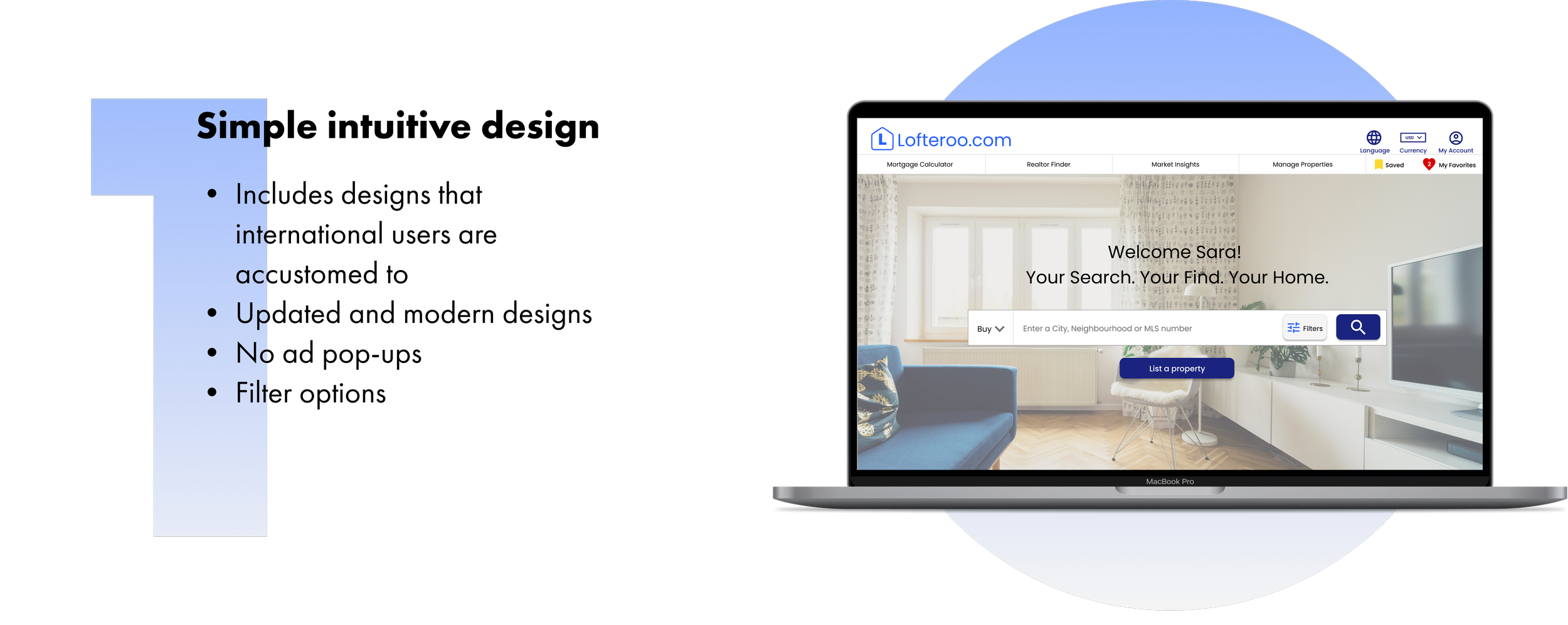
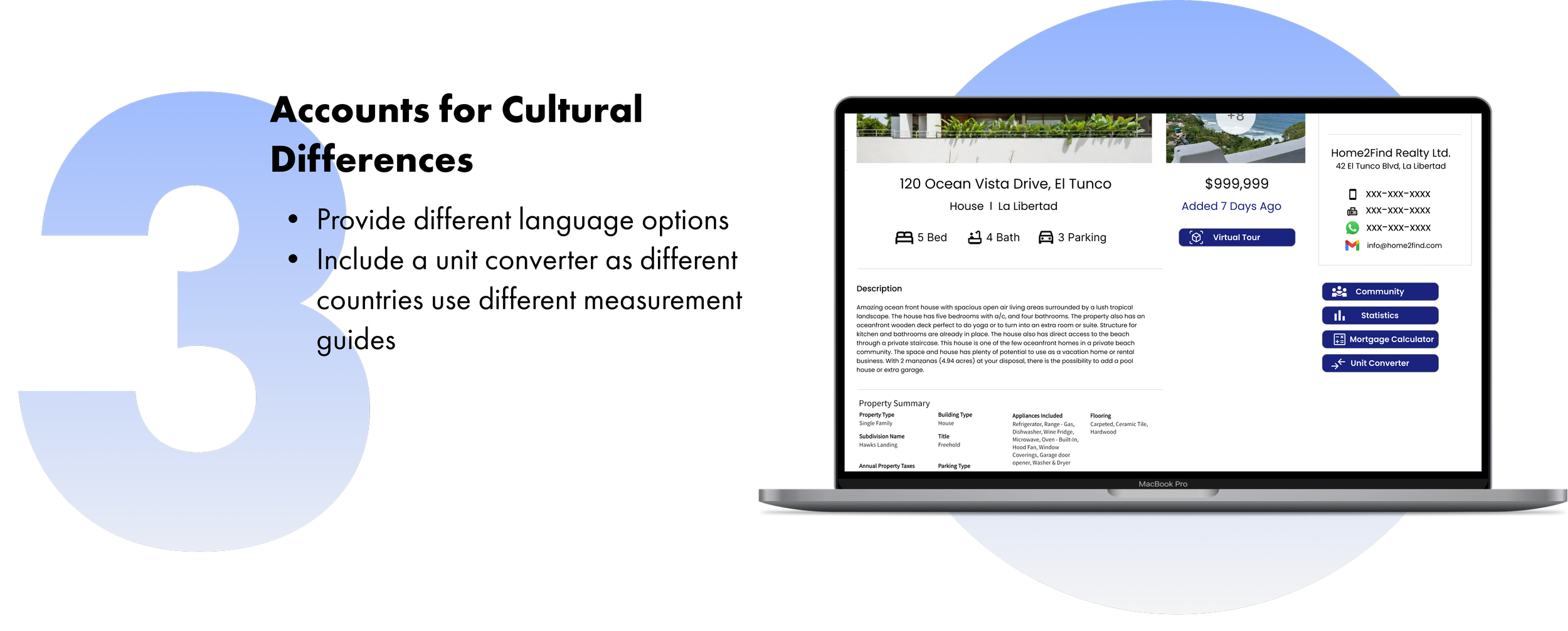
There aren’t many real estate websites for El Salvador, and the ones that exist are outdated and lack features that international buyers are used to having. This makes it difficult for users to buy, rent, and list properties in El Salvador.
Solution
Design a website for Lofteroo that allows users to easily find, view, save & list properties
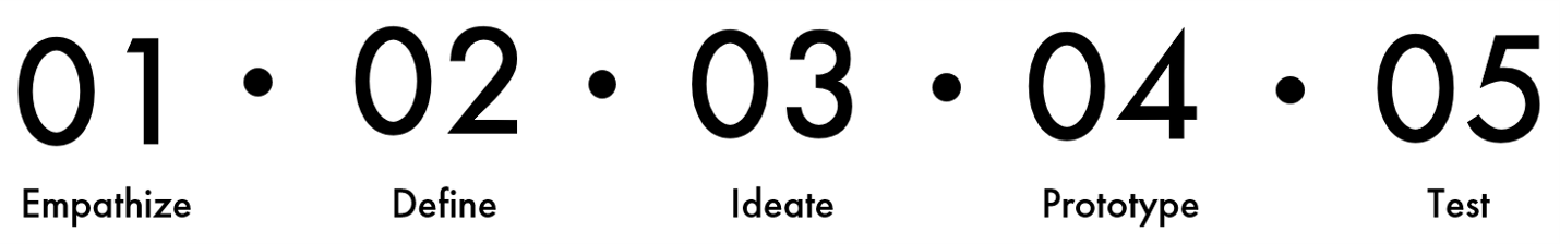
Process Outline
1. Empathize
Interviews
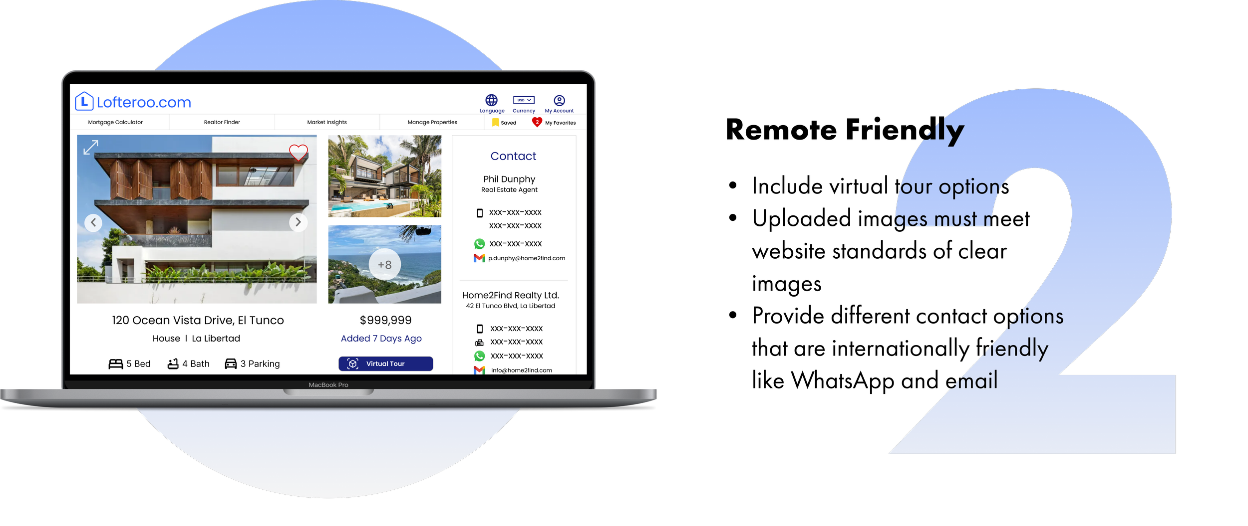
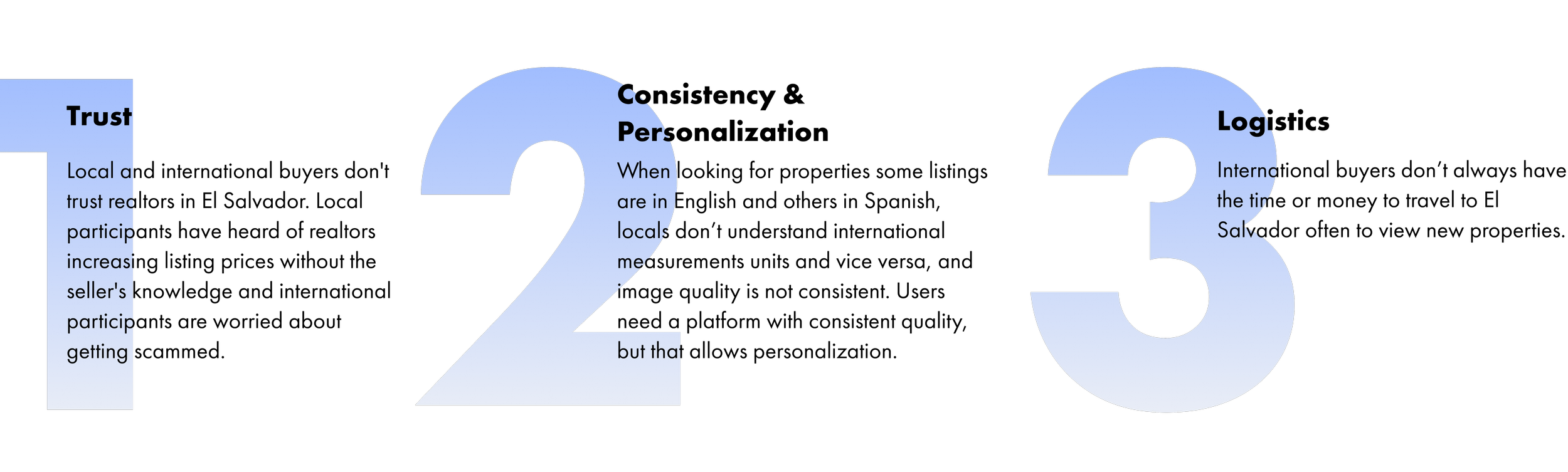
Interviewees want consistent information for each listing and the option to view remotely on a trusted platform.
I conducted 3 interviews ( 2 international users and 1 local user) in order to understand what current challenges they face when trying to find and purchase properties in El Salvador. I derived three main insights:
Competitive Analysis
There aren’t many real estate websites available for El Salvador
I analyzed 4 of the largest real estate platforms available for El Salvador. For starters, there weren’t many websites available for users and the second biggest website was a classified advertisements website. Local users join Facebook marketplace groups thus, don’t reach international buyers. The websites that are focused on real estate are outdated, gimmicky, or only sell specific property types.
2. Define
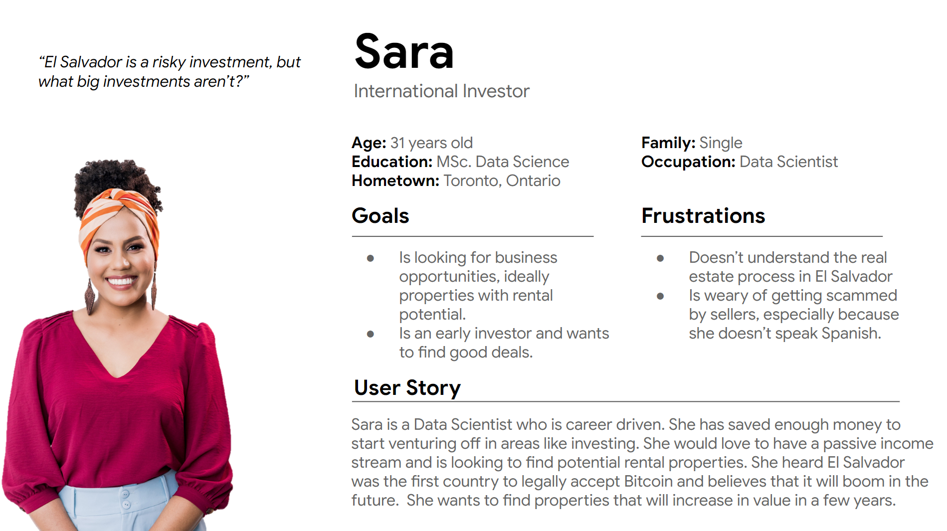
The Investor Persona
3. Ideate
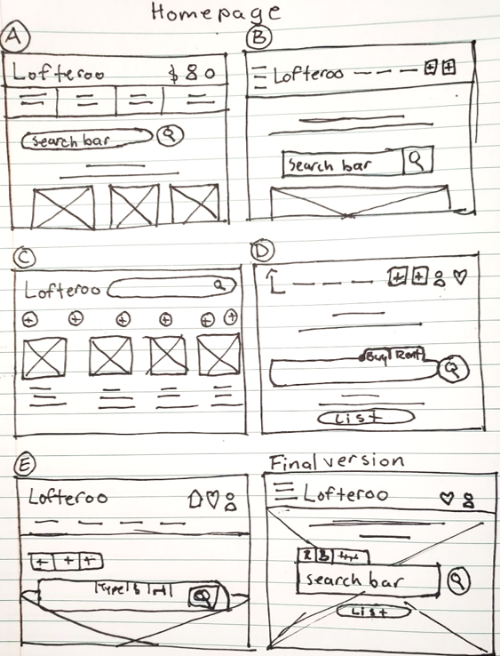
Low-Fidelity Paper Wireframes
I used the Crazy 8 method to sketch eight distinct ideas in eight minutes, with the goal to generate a wide variety of design options.
Site Map (App)

4. Prototype
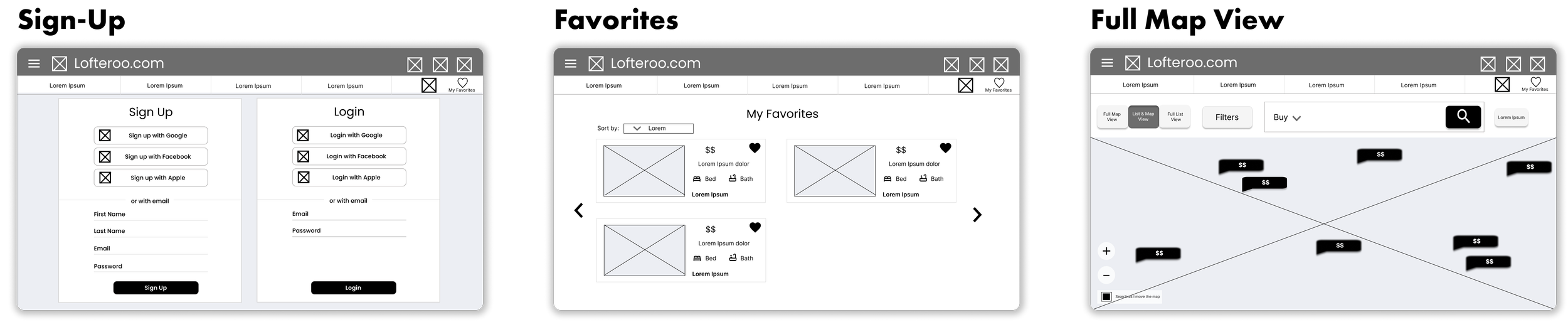
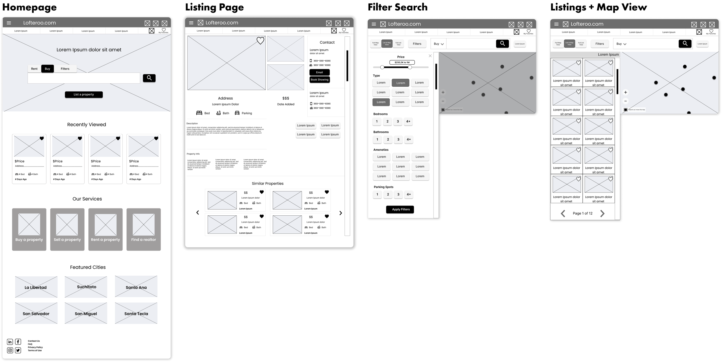
Low-Fidelity Digital Wireframes
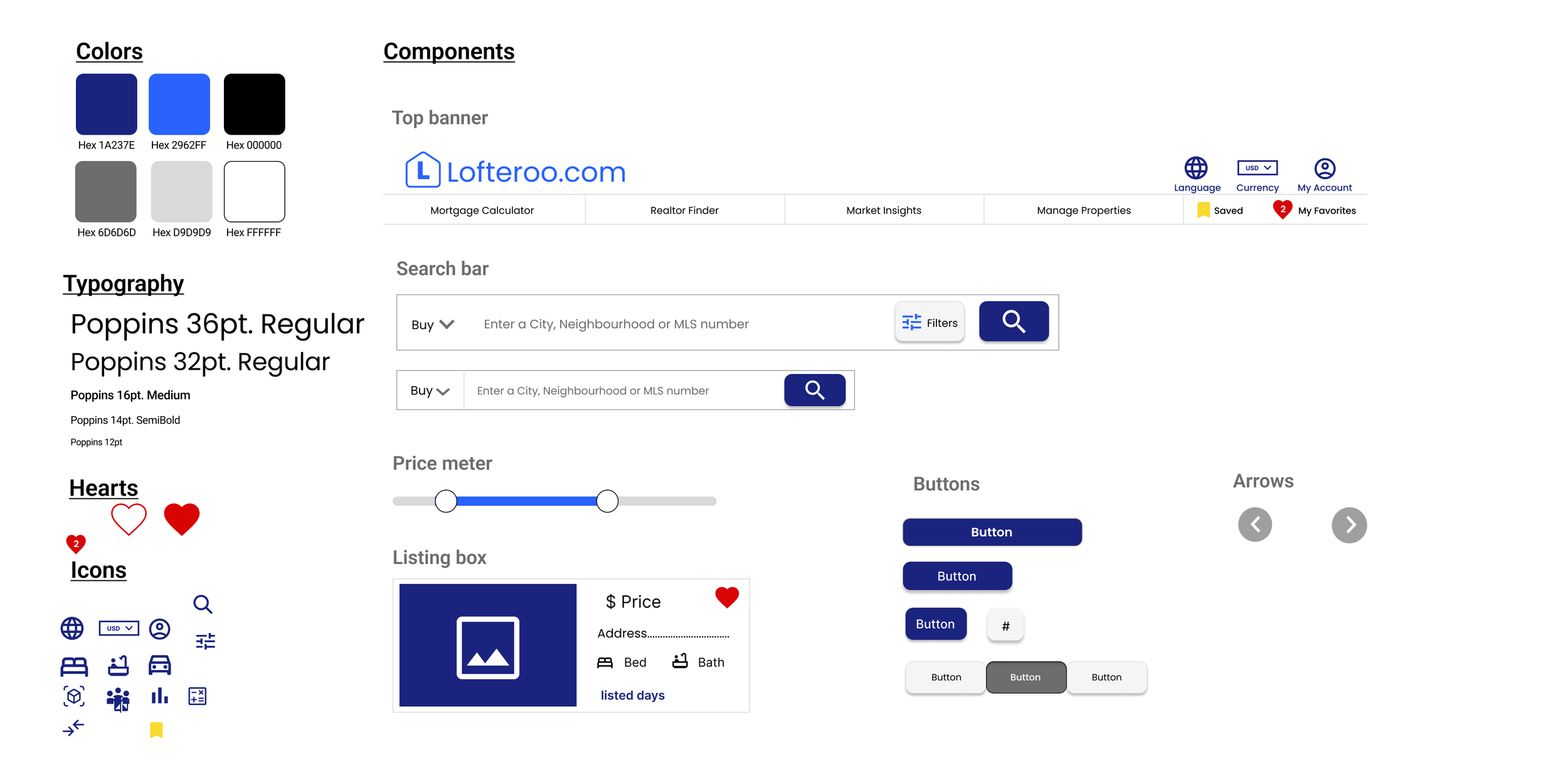
Design System
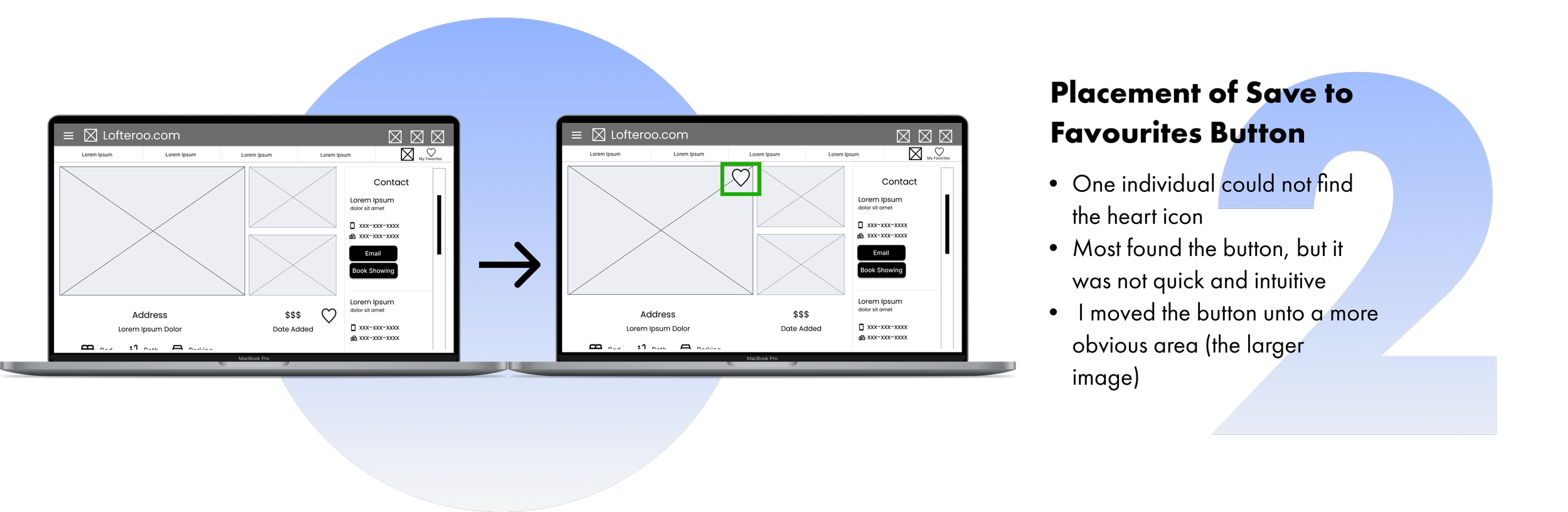
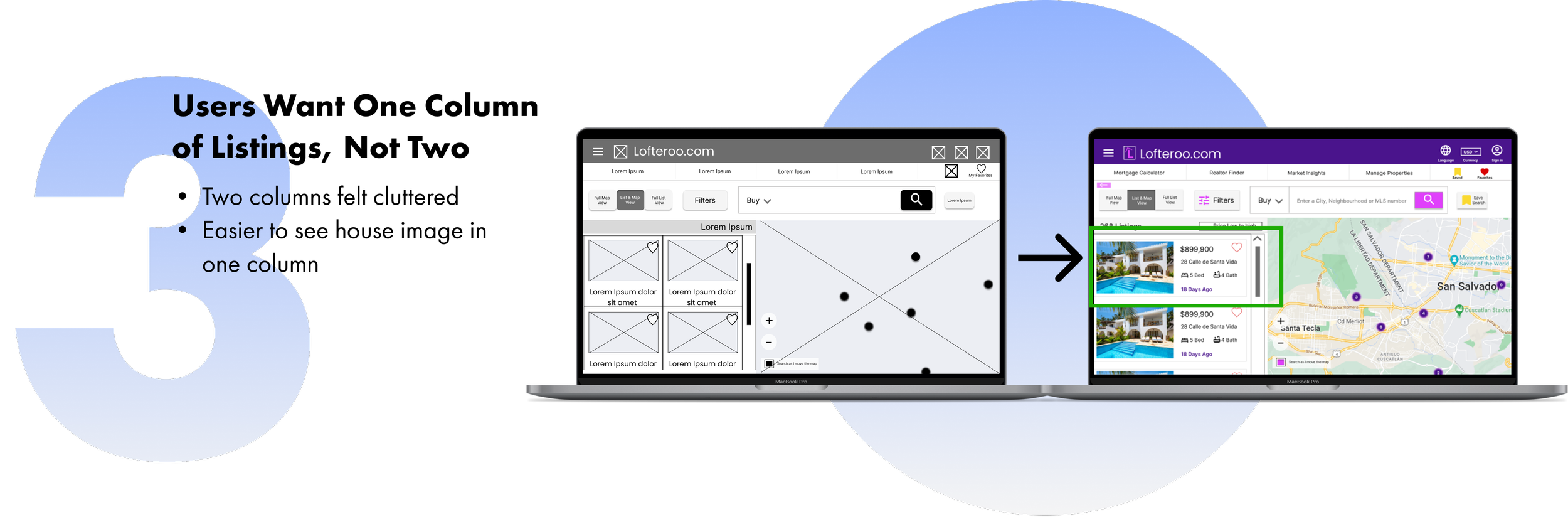
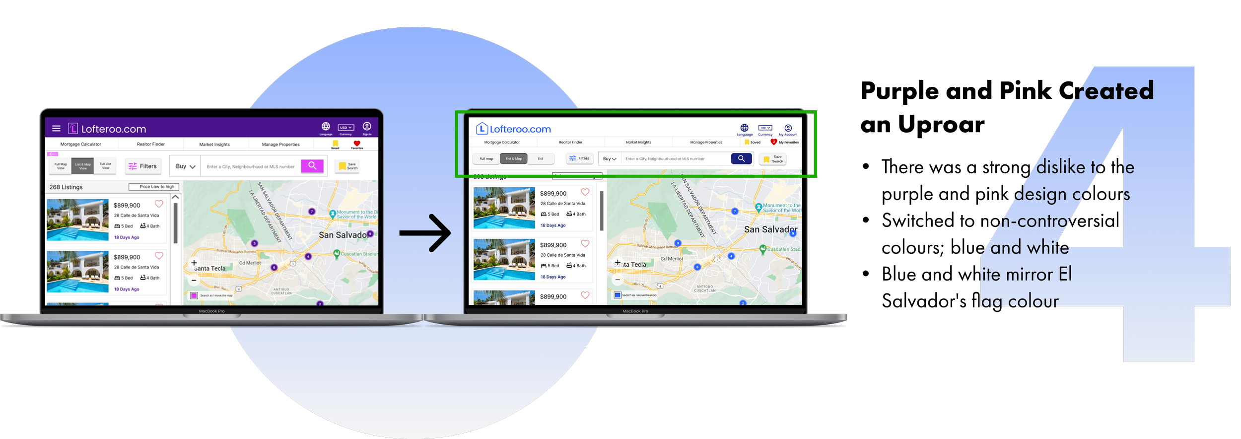
5. Test
Improvements
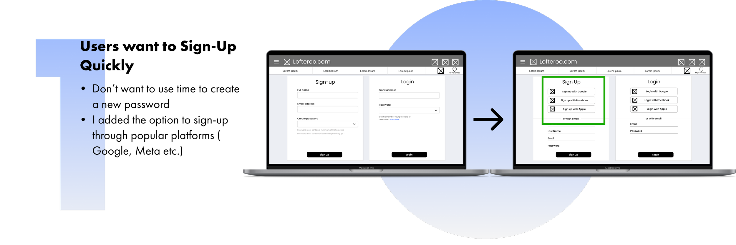
Improvements after usability tests
I conducted 2 rounds of usability studies to guide the design of my wireframes. The feedback from the 6 participants revealed 4 needed improvements:
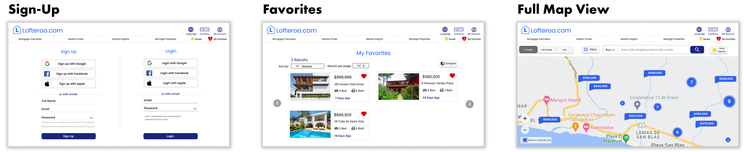
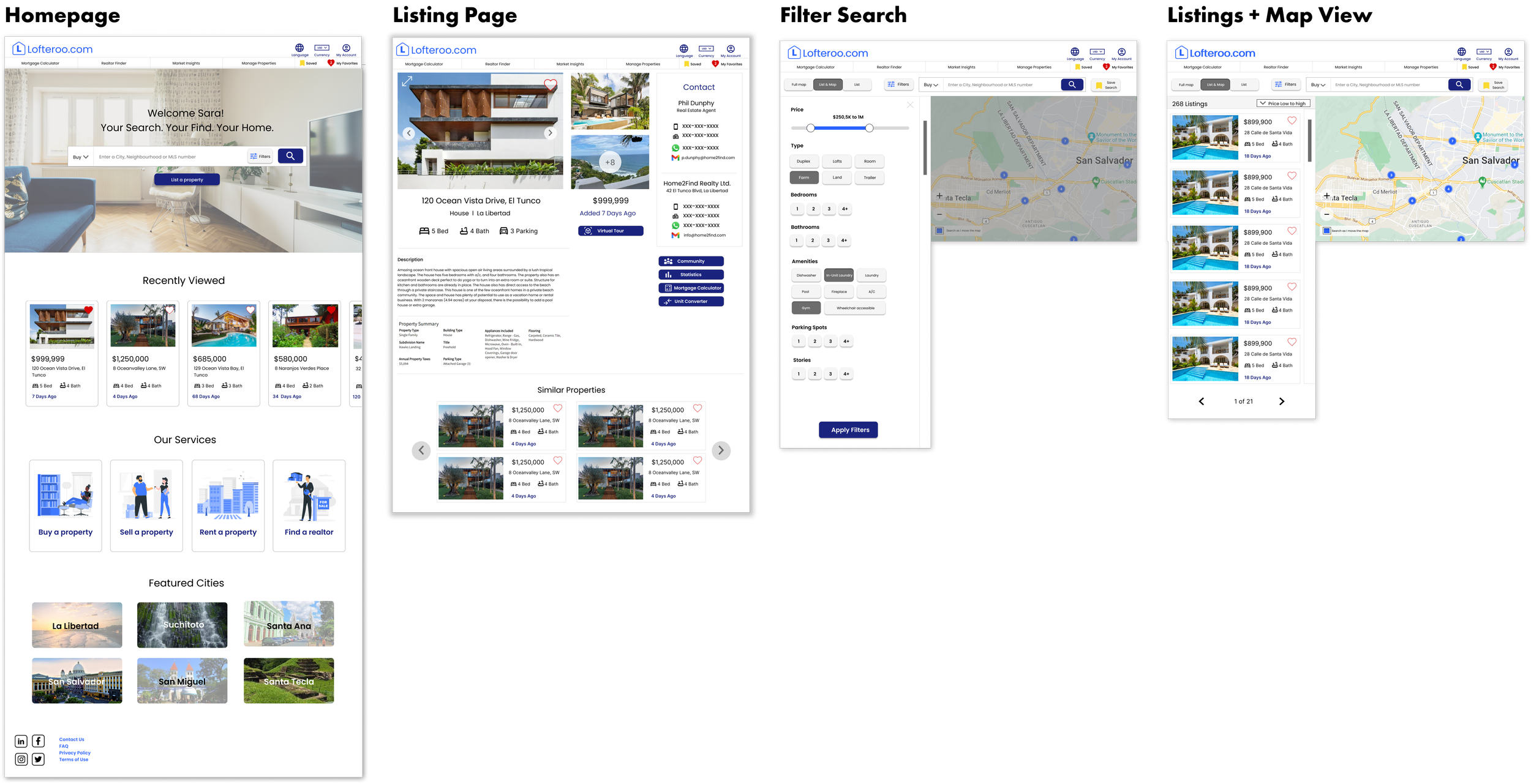
6. Final Outcome
7. Reflections
What I would do differently + Lessons learned
This was my first UX design project!
1. Step back for a new perspective
As this was my first UX Design project, I focused my time on getting it just right. However, I found that even taking a 10-minute break and coming back refreshed helped me find mistakes I hadn’t seen earlier or allowed me to fill missing gaps. Trusting my insights and research led me in the best direction for the users.
2. Keeping it simple often accommodates more users
Even though it's best to avoid presuming what's best for whom, all participants, no matter their origin, chose a simpler design and colour scheme.
3. Save tutorials and instructions
What a journey! I’ve made mistakes and fixed them, I learned that using a grid is a MUST at the beginning and I’ve learned and installed helpful plugins. Throughout this whole process, I’ve used resources from the Google UX design certificate in addition to YouTube tutorials, Google searches, and training videos on Figma. I’m grateful that I have access to so many helpful resources. While I am still learning, I have saved and organized them so that I can refer to them later if necessary.